A.M.C. Davies
Norwich Near Infrared Consultancy, 75 Intwood Road, Cringleford, Norwich NR4 6AA, UK. E-mail: td@nnirc.co.uk
Introduction
The excuse for this column is that it is conference season [I’m absent from the International Diffuse Reflection Conference (IDRC) for the second time—I attended the first 13; I’m missing it!]. So this is the time for “thinking aloud”, “thinking outside the box”, “blue skies thoughts” or any other euphemism for lateral thinking that comes to mind.
I recently “discovered” a very interesting radio programme on BBC Radio 4. It is called More or Less. More or Less is “devoted to the powerful, sometimes beautiful, often abused but ever ubiquitous world of numbers”.1 It has been running for at least five years! It is currently off air but will be back in the winter.
A few weeks ago we were asked to say what we were doing while listening to the programme. The next week we were told that nearly 2000 e-mails had been received and this data had been given to information designer David McCandless2 to turn into a graphic. When this was trailed I got the impression that something new and exciting was going to be displayed and I thought that the graphic would include sound. The graphic is good but rather “ordinary” and I was disappointed.3 This got me thinking about how we display information. Have we made any advance in the last 25 years? Could sound be used!
The most exciting information graphic
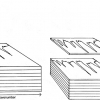
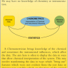
I saw a picture at the 1986 International Diffuse Reflection Conference (Wilson College, Chambersburg, PA, USA), which I thought (and I still do) was brilliant. It is reproduced in Figure 1, courtesy of its designer Dr “Woody” Barton retired scientist, R.B. Russell Agricultural Research Center, Agricultural Research Service, USDA. It was published in the Proceedings of the Second Spectroscopy Across the Spectrum Conference (1990).

These were the days before colour was generally available on computers and the addition of colour might improve the impact of the diagram, but for spectroscopists it needs very little thought to comprehend the vast amount of information that can be obtained by spectroscopy. My NIR group at FRI, Norwich, had moved into colour displays in 1984 when we produced a two-dimensional (2D) “Crome” display of correlation coefficients from NIR data measured at 700 wavelengths,5 which we discussed in the series on matrix algebra in 2002.6 Originally this was done in a two-stage operation. The computations were done in a NOVA4 computer and then transferred to an Apple IIe for display on a colour monitor (the first at FRI!). However, Tom Fearn wrote a MATLAB program, which takes seconds to perform the whole operation in one go. The data shown in Figure 2 is the data set being considered by chemometricians at this year’s IDRC.7 The figure shows which pairs of wavelengths give the best correlation for this data in the midst of an ocean of low correlations. These calculations are for haemoglobin in 435 samples. We were (and remain) quite pleased with this display but as far as we know few people have used it.

Other researchers (including Woody Barton) have done much research on 2D spectroscopy (comparing the same samples run on different spectrometers or under different conditions) and they have invented a range of displays for viewing different aspects of their experiments. However, these are special to their application.
The modern need for displaying information
We thought we were being subjected to an avalanche of data in 1982 but now we have very fast computers and vast files of data that we would like to investigate. An example of this is hyperspectral imaging. These are images of data where every pixel contains a spectrum. We might think of a three-dimensional display but if we were to display every spectrum it would become impossible to see the interesting information. I think we need to find some new ways of investigating such plots and that we need a third dimension, but NOT a visual one. Could we use sound? Within hours of having this idea I was alerted to a story on the BBC website about the London premier of some choral singing which was the result of a collaboration between scientists from the Genome project and composer Michael Zev Gordon. The four bases that make up DNA have been given musical notes and DNA from each of the 40-strong choir has been decoded so that at the climax of the work each member is singing his or her own DNA.8 Can we put this idea into reverse for “data mining”?
Putting sound into data mining
“Data mining” has different meanings to different researchers; my specification is that we are looking for interesting information but we do not know what it is until we find it. This uncertainty means that we cannot specify in advance what spectrum in our hyperspectral image might be found to be interesting so we just need to have a mechanism that will help us to detect the needle-in-the-haystack. At the 2003 International NIR conference there was a session titled “Stretching the NIR spectrum to the limit”. I proposed the question; “How many different NIR spectra can we measure with our current instruments” and then attempted to answer it.9 My answer was that while we might be measuring NIR spectra at 700 wavelengths because of collinearity we didn’t really need many of them, in fact we could do quite well with just eight! NIR instruments have very low levels of noise which makes the photometric scale very large and my conservative estimate was that with one measurement we could specify 3000 different spectra so with eight measurements we could measure 30008 = 6.56 × 1027 spectra.
Making music from spectra
On a very simple level, Table 1 in Groves Dictionary of Music,10 specifies 35 different sounds. If we divide our photometric scale into 35 ranges and assign a sound to each range then our eight measurements could produce 358 = 2.25 × 10¹² different sequences. Not as many as my estimate of the number of spectra but a very large number for use in any given experiment. Can we use this sound archive to detect unusual spectra? Probably not in its complete state; a single image may contain 300 × 300 = 90,000 pixels. If it took 10 seconds to play each eight note sequence it would take 25 hours, say three days listening for eight hours per day! However, we could use the computer to search through the data using a “Sudoku” square of nine pixels to discover if the central pixel is different from its neighbours. A difference in one note would be sufficient to consider the sample different and in order to allow for overlaps, it might be necessary to allow two or three neighbours to be the same. Iteration with a larger square might be required but the problem would be considerably reduced. It would then not take too long to move round the picture, with the aid of a mouse, listening to the remaining pixels, much like a prospector using a metal detector to search for buried treasure. If any were found to be interesting then the complete spectrum would be called-up to see if the material could be identified.
Conclusion
It is just an idea; would anyone like to program it?
References
- news.bbc.co.uk/1/hi/programmes/more_or_less/1628489.stm
- http://www.informationisbeautiful.net/about/
- informationisbeautiful.net/moreorless/more_or_less_is_beautiful.html
- F.E. Barton and D.S. Himmelsbach, in Analytical Applications of Spectroscopy II, Ed by A.M.C. Davies and C.S. Creaser. Royal Society of Chemistry, London, p. 240 (1991).
- A.M.C Davies, M.G. Gee and P.W. Foster, Lab. Practice 33(5), 78–80 (1984).
- A.M.C. Davies and T. Fearn, Spectrosc. Europe 14(6), 24 (2002).
- http://www.idrc-chambersburg.org/shootout2010.html
- http://www.bbc.co.uk/news/10581179
- A.M.C. Davies, in Near Infrared Spectroscopy: Proceedings of the 11th International Conference, Ed by A.M.C. Davies and A. Garrido-Varo. NIR Publications, Chichester, UK, p. 1057 (2004).
- S. Sadie (Ed.), The Grove Concise Dictionary of Music, p. 624 (1994).


